I’m using the phrase “productivity hacks” because it sounds a lot sexier than saying “tools I found online to help me do my job a little better or a little easier.” And, yes, my best hacking days (such that they exist) are ahead of me.
This edition is all about design hacks.
Here are three tools that help you create quick, sharp visuals to add to blog posts (like this one) and use in your Twitter, Instagram, Facebook, and other social media feeds.
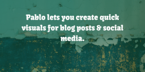
Pablo is perfect for simple design hacks.

This pictures + text tool is very easy to use. Creating the Pablo image for this post took less than a minute from start to download. In addition to its ease of use, I love that Pablo uses Unsplash photos.
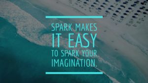
Use Spark when you need a dash of sophistication.

Adobe released Spark last month. It’s more like Canva than Pablo as it offers more bells and whistles, and like Canva its point-and-click interface makes it easy to build some pretty snazzy graphics. I can see it being useful not just for social media posts but also for flyers, posters, and other design needs.
What I don’t like: you have to post an Adobe-hashtagged image before you can get rid of the hashtag. (So first you spam your friends, then you’re good to go.) I’m guessing if this tool takes off there’s going to be a free version with Abobe branding and a paid version without.
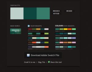
Pictaculous hacks the color pallete for you.

Ever wonder what color palette to use with an image? That’s where Pictaculous comes in. You upload an image, graphic, or other visual, and the tool spits out the color palette and offers suggestions. You’re looking at the information from my Pablo visual for this post. Pictaculous is also very useful when you’re looking for complementary colors for a Web page, a presentation, a logo, and more.
What social media design hacks are you using?
PS: This is the fifth in an occasional series. In case you missed any, here are productivity hacks one, two, three, and four.


