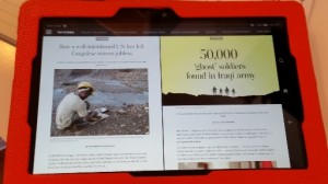
The Washington Post has a new Kindle app, and the design is gorgeous.
It’s clean. It’s visual. It’s readable.

And it’s digital mobile. By which I mean that, unlike The Washington Post‘s “classic” Kindle app, it isn’t trying to mimic the look and layout of the Web site.
These are all good things. But–
(You knew there was a caveat, right?)
It’s a newspaper.
I want news, not a newspaper.
The new app is a curated, two-edition (5:00 a.m. / 5:00 p.m. EST) newspaper focused on national and international stories. But what happens if news breaks at 6:00 a.m.? It’s an odd choice for a company that wants to compete with The New York Times, Financial Times, and the handful of other major English-language papers with broad readership.
The New York Times app may be less sexy, but it lets me read all the news the company sees fit to print online.
One of the great benefits of digital technology is the ability to publish news as it happens, to update stories in real time, and to add context when adding context makes sense. I suspect the two editions are less about “late” news in the U.S. and more about international time zones (like Tokyo, Sydney, and Beijing).
Shifting focus to capture an expanding online audience is smart.
But publishing a newspaper as an app seems a lot like going backward. Especially for a paper owned by a man who understands the concept of digital experience.
There’s a difference between digital experience and digital browsing.
In unveiling the app, the paper said that it wants to “create new digital experiences across platforms.” This is a good thing, and I applaud The Washington Post for thinking about what audiences want and/or expect from different online platforms. And who its Kindle audience is versus its Web site audience versus who reads the print edition of the newspaper.
If this were the guiding principle, I’d be okay. Not buying the app (which actually is free for six months), but buying the effort.
But the Post, in its release article, went further:
One of the most important things we wanted to tackle, and [the] central tenet that the app is visioned around, is the idea that digital browsing, despite its name, isn’t very easy. The signal-to-noise ratio is high in digital news experiences. Sometimes we love that. We confess to being social media addicts who bounce from site to site to site. But there are times when even we feel exhausted by the never-ending stream.
The Washington Post says it wants to “fix digital browsing.”
Digital browsing doesn’t need fixing.
Let’s set aside for a minute the paternalistic tone. The idea that we need someone else to make decisions for us about what stories are important and where and how to find them. (And, really, if The Washington Post thinks its site is filled with noise, stop producing “noise.”)
Digital browsing isn’t broken.
We don’t need better gatekeepers. We need better filters. The difference is all about who controls the flow of information.
I wish The Washington Post had laser-focused on the digital experience and let me continue to filter “news” for myself. Because, as I said at the outset, the digital experience is gorgeous. But the content and context are all wrong for me.
Feature photo by Elsie Esq. (Flickr).


