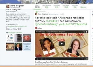
Twitter is rolling out a redesigned look for your page. Key design elements of the new Twitter profile include a screen-length banner photo, a larger avatar, and a more readable “about you” description (i.e., it is no longer hidden in the banner).
The new design is fine, but the content elements really rock.
As part of the redesign, Twitter has created a “pinned tweet” option that lets you select one tweet that will show up at the top of your timeline whenever someone lands on your profile page. It’s akin to a free sponsored tweet.

This is valuable real estate, so use it wisely.
For my first pinned tweet, I created and pinned a tweet featuring my Small Business Tech Chat conversation. It’s visual. It’s actionable (you can click right into the video). And it’s promotional without screaming “me, me, me” (well, at least I hope it’s not screaming at you).
Be aware of photos and favorites.
In addition to pinned tweets, the new Twitter profile gives more prominence to both visual content (the second stream after tweets is photos/videos) and to favorites.

While the focus on visual content is an extension of something Twitter’s been doing for a while, the addition of a separate photo/video stream means that people looking for information about you (or your brand page) can opt to look exclusively at this one category of content.
Meanwhile, the addition of a more-visible favorites streams means that you might want to think more strategically (if you aren’t already) about the content that lives in there.
Engagement is rewarded.
Finally, it’s important to understand that the new Twitter profile rewards engagement by making those posts that have retweets and favorites (or more retweets and favorites) larger. It’s also easier to see at a glance whether someone’s tweets are getting traction.
Have you converted to the new Twitter profile? If so, what adjustments have you made?


